Color does far more than decorate a room\u2014it shapes how we feel in it. Understanding a bit of color psychology can turn everyday decorating decisions into deliberate tools for setting the mood you actually want in each space of your home.
Blues and Greens for Calm Spaces
Cool tones like soft blue and sage green are strongly associated with relaxation and calm. They’re excellent choices for bedrooms and bathrooms, where the goal is winding down rather than energizing up.
Warm Yellows and Oranges for Energy
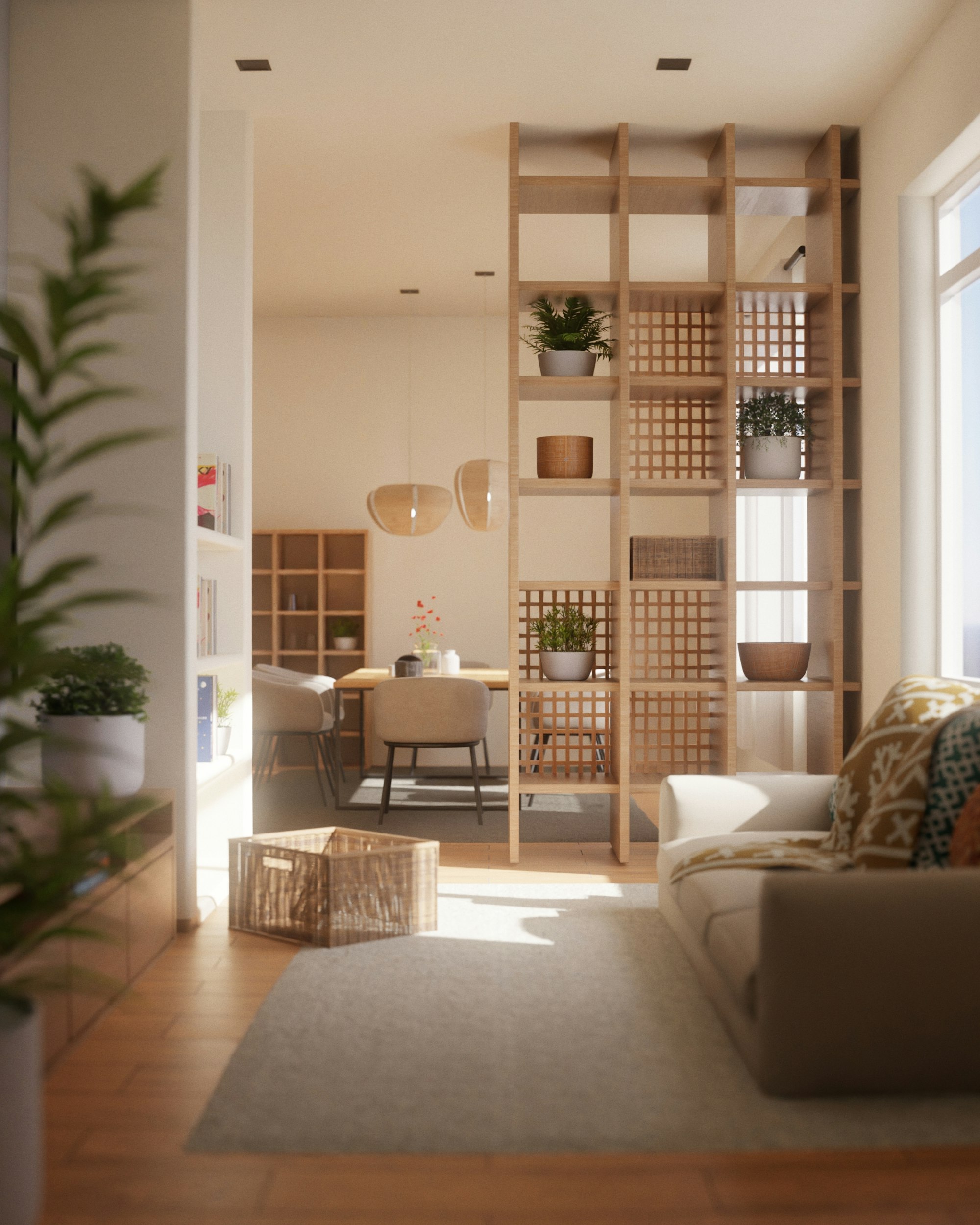
Warm, sunny tones evoke optimism and energy, making them well-suited to kitchens, dining rooms, and home offices where you want to feel alert and engaged rather than sleepy.
Rich Reds for Social Spaces
Red stimulates appetite and conversation, which is part of why it appears so often in dining rooms and social areas. Used as an accent rather than an overwhelming main color, it adds warmth and vibrancy.
Neutral Tones for Flexibility
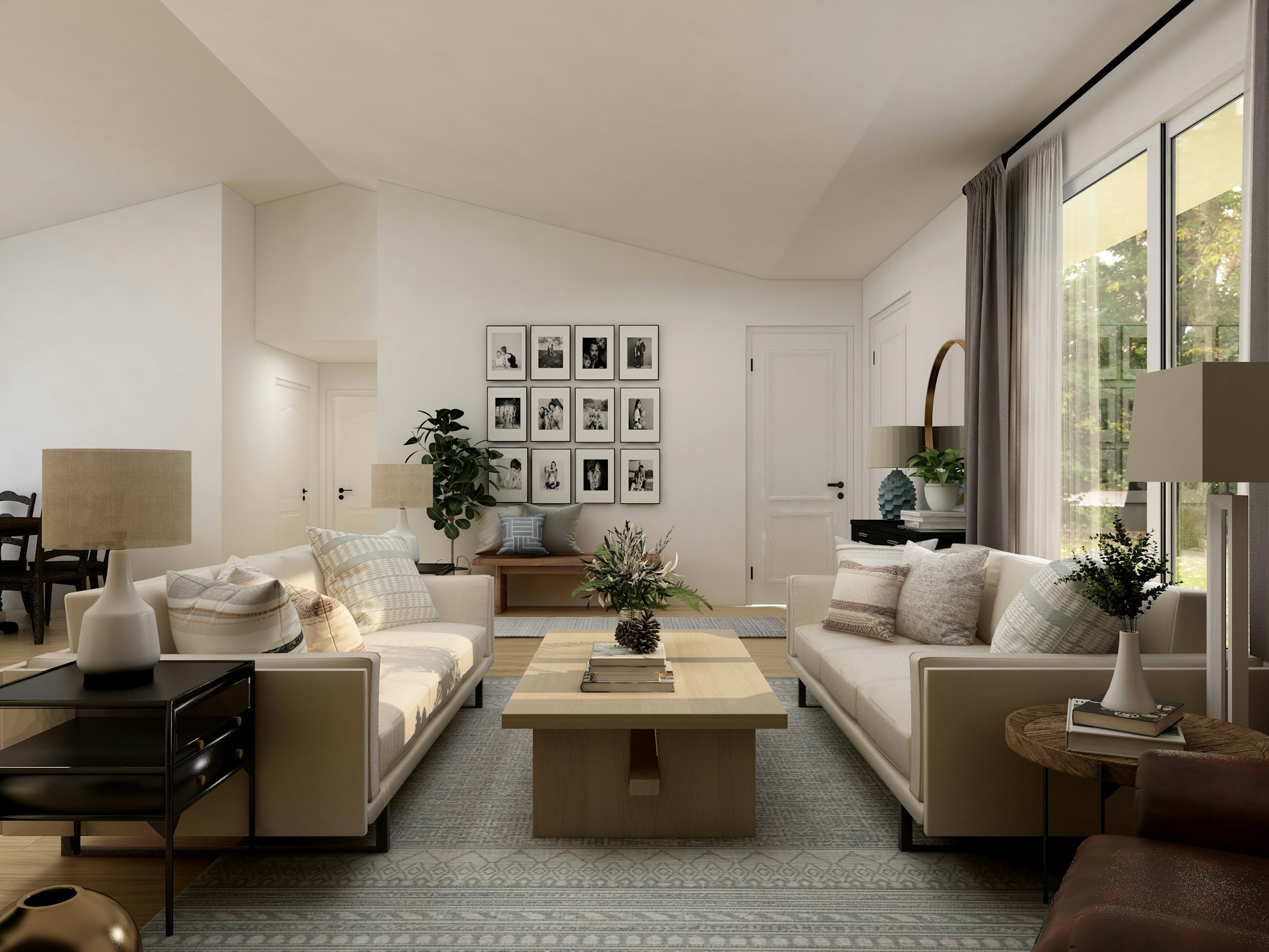
Beige, gray, and white create a calm, flexible backdrop that lets furniture and accessories take center stage. They’re a safe, timeless choice for shared or transitional spaces.
Purple for Creativity and Luxury
Deeper purples are associated with creativity and luxury, making them an interesting choice for a home office, a reading nook, or an accent wall in a space meant to feel a bit special.
Using Color Strategically Room by Room
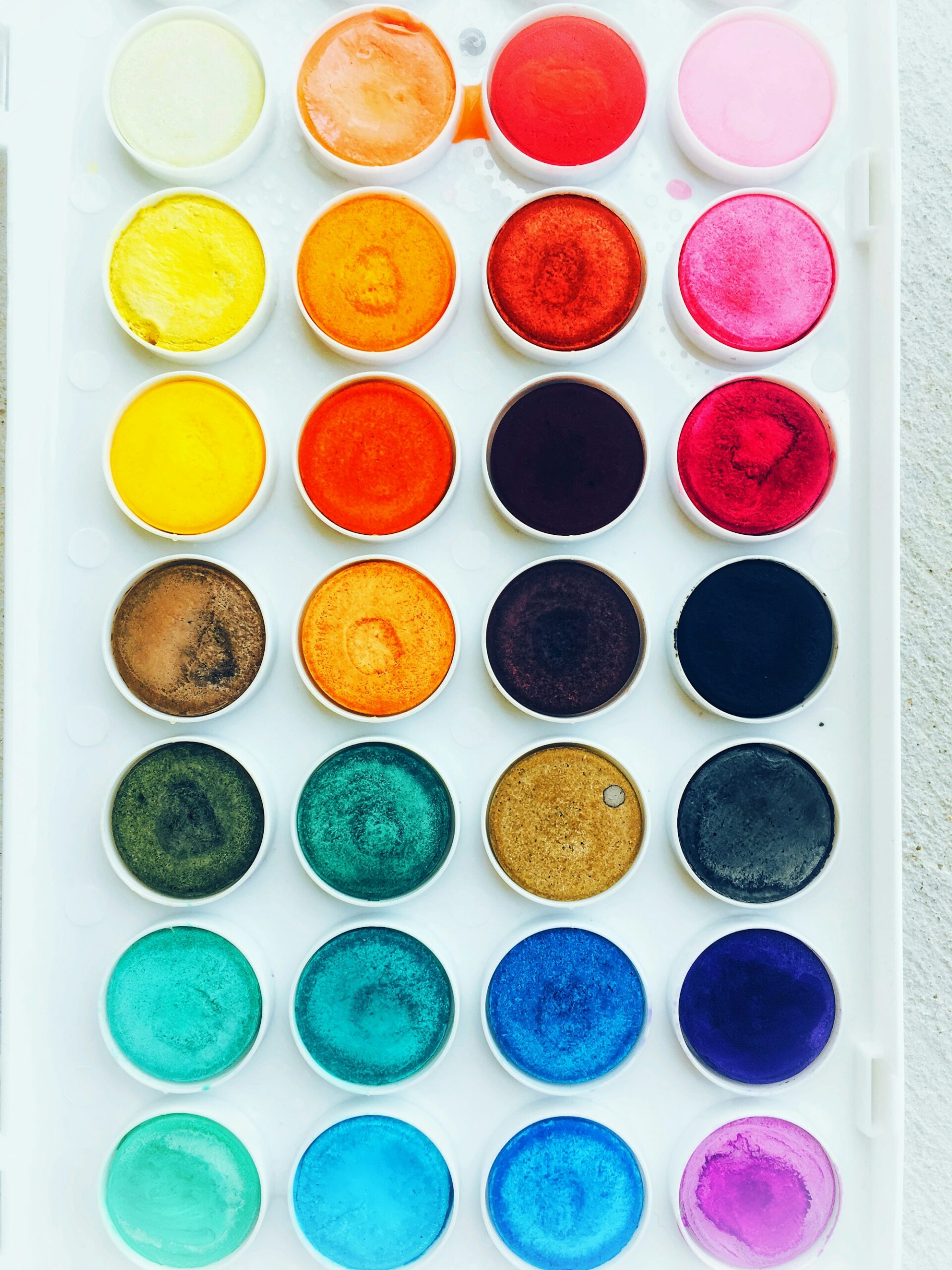
Rather than picking one color for the whole home, consider each room’s actual purpose. A calming bedroom palette doesn’t need to match an energizing kitchen one\u2014intentional variation, tied together by a few consistent neutral tones, often reads better than forced uniformity.
Wrapping Up
Color choices are one of the most powerful, least expensive design tools available. Understanding the psychology behind different hues lets you shape not just how a room looks, but how it actually feels to spend time in.